
Content model reference
Page Types
Page types define the body of a page. Every Page entry references exactly one of them, and that choice determines which modules an editor can use. A page body cannot be converted into another type later – it has to be rebuilt – so pick the right one when the page is created.
1. Page
Name in Contentful: 📄 Page Content type ID: page Entry title: internalName
Specification:no dedicated story; page templates covered by CS-22 (Done)
The Page entry is the only content type that produces a URL. It carries the routing information and frames (header, footer, breadcrumbs) and delegates the actual body to one typed page-body entry. Every new page on the site starts here.
| Field | Field ID | Type | Req. | Loc. | Rules and allowed values | Notes for editors |
|---|---|---|---|---|---|---|
| Market | vileda | JSON object (app) | Yes | No | Set through the Market field app. | Assigns the entry to the market or markets it belongs to. Mandatory on almost every content type – pick the markets in the app interface rather than editing the JSON. |
| Internal Name | internalName | Short text (Symbol) | Yes | No | Free text. | Editorial working title. Not shown on the website; it is the entry title in lists, search and reference pickers. Use a clear, consistent pattern, e.g. “PLP | Mops | Highlight Card”. |
| Slug | slug | Short text (Symbol) | No | Yes | Must be unique across all pages. | The URL path of the page. Leave empty only for the entry that represents the site root. Because the field is localised, each language can have its own path. A page cloned for a market keeps the English slug until you maintain the local one. |
| Breadcrumb Items | breadcrumbItems | List of references (entries) | No | No | Breadcrumb Item entries only. | Ordered segments after “Home”; Home is added by the frontend. Empty = homepage. The last item is the current page – leave its Page reference empty. Maintained manually, not derived from navigation. |
| Header | header | Reference (entry) | Yes | No | Header entries only. | Normally the one shared site header. Reference it, do not duplicate it. |
| Footer | footer | Reference (entry) | Yes | No | Footer entries only. | Normally the one shared site footer. Reference it, do not duplicate it. |
| Content | content | Reference (entry) | Yes | No | Content Page, Homepage, Product Detail Page, Product Listing Page, Commercial Page or Article Page. | The page body. The type you pick here decides which modules are available – it cannot be swapped later without rebuilding the body entry. |
2. Homepage
Name in Contentful: 📄 Homepage Content type ID: homepage Entry title: internalName
Specification:CS-123 (Ready for Development)
Design:Homepage (Playbook V01)
The body type for the market homepage. It is not a fixed template: a mandatory Hero opens the page and everything below it is an ordered list of modules that you assemble and re-order per market. Breadcrumbs are never shown on the homepage.
| Field | Field ID | Type | Req. | Loc. | Rules and allowed values | Notes for editors |
|---|---|---|---|---|---|---|
| Market | vileda | JSON object (app) | Yes | No | Set through the Market field app. | Assigns the entry to the market or markets it belongs to. Mandatory on almost every content type – pick the markets in the app interface rather than editing the JSON. |
| Internal Name | internalName | Short text (Symbol) | Yes | No | Free text. | Editorial working title. Not shown on the website; it is the entry title in lists, search and reference pickers. Use a clear, consistent pattern, e.g. “PLP | Mops | Highlight Card”. |
| Hero | hero | Reference (entry) | Yes | No | Hero entries only. | The stage at the top of the homepage. Mandatory – the page cannot be published without it. |
| Component List | componentList | List of references (entries) | No | No | Accordion, Flowbox Component, HubSpot Component, Full Size Media, Steps, Link List, Headline, Text, Card Collection, Highlight, Cross Selling. | Modules below the hero, rendered top to bottom in the order shown. Drag to reorder. |
Editorial notes
- Leave Breadcrumb Items empty on the Page entry that points at a Homepage – the homepage must not show a breadcrumb.
- The header sits transparently over the homepage hero and turns white on scroll. The frontend controls this, you cannot.
- The order of the Component List is the rendering order; there is no fixed template to fall back on.
3. Content Page
Name in Contentful: 📄 Content Page Content type ID: contentPage Entry title: internalName
Specification:CS-299 (Ready for Refinement), CS-466 (Done)
Design:Insights hub · Rooms · Rooms / Kitchen · Article · Routine · Product guides & care / Turbo · All contents · Ranges · Ranges / Pet Pro · About Vileda
The single flexible body type behind all editorial and static pages – the Vileda Insights hub with its room, article, routine and product-guide pages, the Ranges pages, About Vileda, support and legal pages. An optional Hero sits at the top; the rest of the page is an ordered list of modules chosen per page.
| Field | Field ID | Type | Req. | Loc. | Rules and allowed values | Notes for editors |
|---|---|---|---|---|---|---|
| Market | vileda | JSON object (app) | Yes | No | Set through the Market field app. | Assigns the entry to the market or markets it belongs to. Mandatory on almost every content type – pick the markets in the app interface rather than editing the JSON. |
| Internal Name | internalName | Short text (Symbol) | Yes | No | Free text. | Editorial working title. Not shown on the website; it is the entry title in lists, search and reference pickers. Use a clear, consistent pattern, e.g. “PLP | Mops | Highlight Card”. |
| Hero | hero | Reference (entry) | No | No | Hero entries only. | Optional stage. Leave empty for pages that start directly with content. |
| Component List | componentList | List of references (entries) | No | No | Accordion, Headline, Flowbox Component, HubSpot Component, Full Size Media, Steps, Link List, Text, Card Collection, Highlight, Cross-Selling. | The page body, rendered in the order shown. Headline is available here but not on the homepage. |
Editorial notes
- There is no fixed template: pick and order the modules yourself. Nothing forces a hero or a breadcrumb.
- Slug, breadcrumb trail, header and footer belong to the parent Page entry, not to the Content Page.
- Breadcrumbs belong on deeper pages; leave them off top-level hub pages such as the Insights landing page.
4. Article Page
Name in Contentful: 📄 Article Page Content type ID: articlePage Entry title: internalName
Specification:CS-466 (Done), CS-299 (Ready for Refinement)
The page body for editorial article pages. Like the other page bodies it is referenced from a Page entry, which carries the slug, breadcrumbs, header and footer. It offers an optional hero and a free list of editorial modules.
| Field | Field ID | Type | Req. | Loc. | Rules and allowed values | Notes for editors |
|---|---|---|---|---|---|---|
| Market | vileda | JSON object (app) | Yes | No | Set through the Market field app. | Assigns the entry to the market or markets it belongs to. Mandatory on almost every content type – pick the markets in the app interface rather than editing the JSON. |
| Internal Name | internalName | Short text (Symbol) | Yes | No | Free text. | Editorial working title. Not shown on the website; it is the entry title in lists, search and reference pickers. Use a clear, consistent pattern, e.g. “PLP | Mops | Highlight Card”. |
| Hero | hero | Reference (entry) | No | No | Hero entries only. | Optional stage at the top of the article. Leave empty for articles that start directly with content. |
| Component List | componentList | List of references (entries) | No | No | Accordion, HubSpot Component, Full Size Media, Card Collection, List Block, Headline, Steps, Link List, Highlight Block, Quote, 2 Column Block. | The article body, rendered top to bottom in the order shown. Drag to reorder. Quote and Highlight Block are available here, which makes this the richest editorial toolbox of all page types. |
5. Product Detail Page (PDP)
Name in Contentful: 📄 Product Detail Page Content type ID: productDetailPage Entry title: internalName
Specification:CS-287 (Vileda QA on S1), CS-507 (Done)
Design:PDP prototype (Diseño v03)
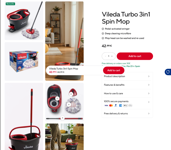
The body type for a product detail page. The commercial part – product title, benefits, price, availability, variants and the add-to-cart actions – is delivered by SAP Commerce Cloud through the product code and cannot be edited in Contentful. Contentful contributes the media gallery, the information accordions and the modules below.
| Field | Field ID | Type | Req. | Loc. | Rules and allowed values | Notes for editors |
|---|---|---|---|---|---|---|
| Market | vileda | JSON object (app) | Yes | No | Set through the Market field app. | Assigns the entry to the market or markets it belongs to. Mandatory on almost every content type – pick the markets in the app interface rather than editing the JSON. |
| Internal Name | internalName | Short text (Symbol) | Yes | No | Free text. | Editorial working title. Not shown on the website; it is the entry title in lists, search and reference pickers. Use a clear, consistent pattern, e.g. “PLP | Mops | Highlight Card”. |
| Product Code | productCode | Short text (Symbol) | Yes | No | Free text. | The SAP product code. This is the link to the commerce system – a typo here means the page shows no product data. Copy it from SAP, never type it from memory. |
| Primary Image | primaryImage | Reference (entry) | Yes | No | Image entries only. | The lead visual in the product head. Use the approved packshot for this product. |
| Secondary Image | secondaryImage | Reference (entry) | Yes | No | Image entries only. | The second visual shown alongside the primary one. It is mandatory, so plan two approved visuals for every product. |
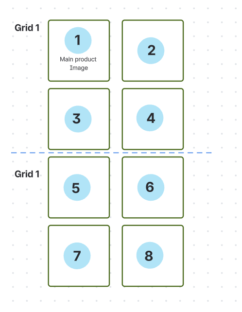
| Top Grid Layout | topGridLayout | Short text (Symbol) | Yes | No | grid-1 … grid-7. | Predefined arrangement of the upper page area. Pick the layout agreed with the design team for this product type. |
| Bottom Grid Layout | bottomGridLayout | Short text (Symbol) | Yes | No | grid-1 … grid-7. | Predefined arrangement of the lower page area. |
| Show Cross-Selling Products | showCrossSellingProducts | Boolean | No | No | Yes / No. | Switches the cross-selling row on. The products shown there come from SAP, not from Contentful. |
| Show Upselling Products | showUpsellingProducts | Boolean | No | No | Yes / No. | Switches the upselling row on. The products shown there come from SAP, not from Contentful. |
| Media Items | mediaItems | List of references (entries) | Yes | No | Media, Image or Video entries. | The product gallery, in display order. The first item is the lead visual. Prefer the newer Image and Video types for new content. |
| Accordions | accordions | List of references (entries) | Yes | No | PDP Accordion entries only. Maximum 3 – an editorial rule that the system does not check. | Information rows below the product head. Always in this order: 1 Product description, 2 Features and benefits, 3 How to use and care – the position decides the section. At least one is required, three at most. |
| Component List | componentList | List of references (entries) | No | No | Accordion, Flowbox Component, HubSpot Component, Full Size Media, Steps, Headline, Text, Card Collection, Highlight or Cross-Selling entries. | Additional storytelling modules below the product area, rendered top to bottom in the order shown. Drag to reorder. |
Editorial notes
- The order of the commercial areas on the PDP is fixed; you cannot rearrange them.
- Product title and benefits come from SAP Commerce – they cannot be overridden here.
- The “lowest price in 30 days” note next to a discounted price is generated automatically; there is no field for it.
- Both grid layout fields are mandatory: choose a value from grid-1 to grid-7 for the top and the bottom area.
- The gallery grid currently takes up to eight items. An extension to twelve is planned but not yet part of the model.
6. Product Listing Page (PLP)
Name in Contentful: 📄 Product Listing Page Content type ID: productListingPage Entry title: internalName
Specification:CS-158 (QA Testing on S1)
Design:PLP (Playbook V02)
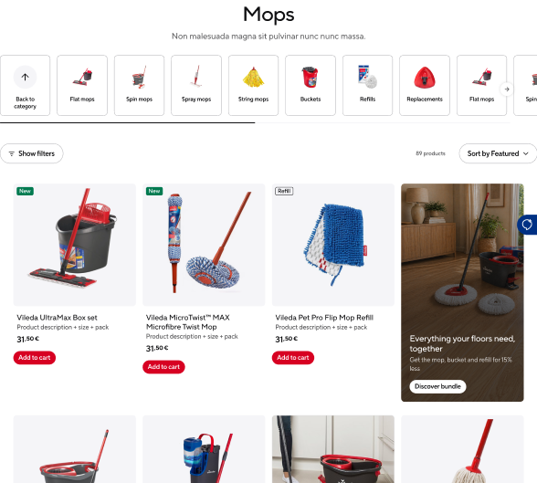
The body type for a category listing page. The product grid is filled from SAP Commerce through the category ID, so products are not maintained here. In Contentful you add the headline and optional subline, curate the sub-category slider above the grid and place promotional highlight cards inside it.
| Field | Field ID | Type | Req. | Loc. | Rules and allowed values | Notes for editors |
|---|---|---|---|---|---|---|
| Market | vileda | JSON object (app) | Yes | No | Set through the Market field app. | Assigns the entry to the market or markets it belongs to. Mandatory on almost every content type – pick the markets in the app interface rather than editing the JSON. |
| Internal Name | internalName | Short text (Symbol) | Yes | No | Free text. | Editorial working title. Not shown on the website; it is the entry title in lists, search and reference pickers. Use a clear, consistent pattern, e.g. “PLP | Mops | Highlight Card”. |
| Headline | headline | Short text (Symbol) | Yes | Yes | Free text. | Page headline above the product grid. Keep it short and search-friendly. |
| Subline | subline | Rich text | No | Yes | Bold, italic, underline. Links to URLs and to Page entries. No headings, lists or embedded media. | Short introduction below the headline. One or two sentences – this is not the place for a full SEO text. |
| Category ID | categoryId | Short text (Symbol) | Yes | No | Free text. | The SAP category this page lists. Determines which products appear. Copy it from SAP. |
| Sub-Category Cards | subCategoryCards | List of references (entries) | No | No | Sub-Category Card entries only. | Ordered cards in the slider above the filter bar. Use them to guide users into narrower categories. |
| Highlight Cards | highlightCards | List of references (entries) | No | No | PLP Highlight Card entries only. | Promotional cards injected into the product grid. Each card carries its own position. |
| Component List | componentList | List of references (entries) | No | No | Accordion, Flowbox Component, Full Size Media, Steps, Headline or Text entries. | Modules below the product grid, e.g. an SEO accordion or a UGC gallery. Smaller selection than on other page types. |
Editorial notes
- Headline and Category ID are mandatory; the subline may stay empty.
- The sub-category slider only becomes a carousel when there are more cards than fit. You cannot force it.
- Product paging (infinite scroll, then a “Load more” button) is handled by the frontend.
- Highlight card positions are not checked for collisions – verify yourself that no two cards claim the same slot.
7. Commercial Page
Name in Contentful: 📄 Commercial Page Content type ID: commercialPage Entry title: internalName
Specification:CS-403 (Done)
A single generic body type covering the three transactional pages – cart, checkout and profile. The interface is delivered by SAP Commerce Cloud; the Contentful entry exists so supporting content can be placed around it. The Type field decides which of the three pages an entry represents.
| Field | Field ID | Type | Req. | Loc. | Rules and allowed values | Notes for editors |
|---|---|---|---|---|---|---|
| Market | vileda | JSON object (app) | Yes | No | Set through the Market field app. | Assigns the entry to the market or markets it belongs to. Mandatory on almost every content type – pick the markets in the app interface rather than editing the JSON. |
| Internal Name | internalName | Short text (Symbol) | Yes | No | Free text. | Editorial working title. Not shown on the website; it is the entry title in lists, search and reference pickers. Use a clear, consistent pattern, e.g. “PLP | Mops | Highlight Card”. |
| Type | type | Short text (Symbol) | Yes | No | cart, checkout, profile. | Selects which SAP interface is rendered. Only one page per type and market. |
| Component List | componentList | List of references (entries) | No | No | Accordion entries only. | Optional supporting content, e.g. a payment FAQ accordion. Keep it minimal on checkout. |
Editorial notes
- Type is mandatory and decides which transactional page the entry belongs to. One entry per type and market.
- Only Accordion entries can be added to the component list here.