
Content model reference
Base Elements
Base elements are the small, highly reusable pieces that components are assembled from: links, buttons, text blocks, media and documents. Before creating a new one, check whether a suitable entry already exists – reuse keeps the space maintainable and makes site-wide changes possible in one place.
1. Link
Name in Contentful: ⚙️ Link Content type ID: link Entry title: internalName
Specification:CS-152 (QA Testing on S1), CS-283 (Done)
Design:Link (Playbook V02) · Link (Playbook V01)
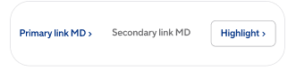
The single text-link element used across the site: inline in body copy, in link lists such as footer columns, and as a standalone pill-shaped navigation prompt. It is for navigation only – anything that triggers an action (submitting a form, opening a modal, adding to cart) must be a Button.
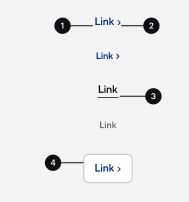
| Field | Field ID | Type | Req. | Loc. | Rules and allowed values | Notes for editors |
|---|---|---|---|---|---|---|
| Market | vileda | JSON object (app) | Yes | No | Set through the Market field app. | Assigns the entry to the market or markets it belongs to. Mandatory on almost every content type – pick the markets in the app interface rather than editing the JSON. |
| Internal Name | internalName | Short text (Symbol) | Yes | No | Free text. | Editorial working title. Not shown on the website; it is the entry title in lists, search and reference pickers. Use a clear, consistent pattern, e.g. “PLP | Mops | Highlight Card”. |
| Label | label | Short text (Symbol) | Yes | Yes | Free text. | The clickable text. Write meaningful labels – avoid “click here”. |
| Has Chevron | hasChevron | Boolean | Yes | No | Yes / No. | Shows the arrow indicator after the label. |
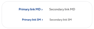
| Type | type | Short text (Symbol) | Yes | No | Primary, Secondary, Highlight. | Visual style. Use Highlight sparingly – at most one per section. |
| Size | size | Short text (Symbol) | Yes | No | MD or SM. | MD is the default size; SM for dense areas such as the footer. |
| Internal Page | internalPage | Reference (entry) | No | No | Page entries only. | Use this for anything inside the site – the URL then follows the page automatically. Fill either this field or External URL, not both. |
| External URL | externalUrl | Short text (Symbol) | No | No | Free text – no format validation. | Only for targets outside the site. Include https://. Not validated, so test the link after publishing. |
| Open in New Tab | openInNewTab | Boolean | Yes | No | Yes / No. | Standard practice: Yes for external targets and documents, No for internal pages. |
Editorial notes
- Type: Primary for inline copy, Secondary for lists such as footer columns, Highlight for standalone pill-shaped prompts.
- Do not mix Primary and Secondary within one list; Highlight does not belong in body copy.
- Write labels that make sense out of context – “Product care guide”, not “click here”.
- Colour adaptation on light and dark backgrounds, hover and focus styling are handled by the frontend.
2. Button
Name in Contentful: ⚙️ Button Content type ID: button Entry title: internalName
Specification:CS-197 (QA Testing on S1)
Design:Button (Playbook V02)
The call-to-action element for actions, available on every page type. One data structure covers four visual shapes: standard text button, icon-only button, play button and chatbot button. Use a Button when something happens; use a Link when the visitor is sent to another page.
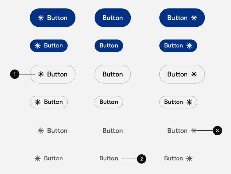
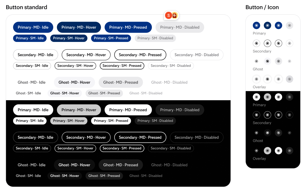
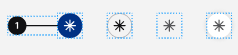
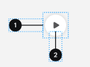
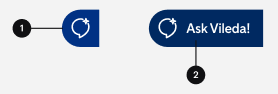
| Field | Field ID | Type | Req. | Loc. | Rules and allowed values | Notes for editors |
|---|---|---|---|---|---|---|
| Market | vileda | JSON object (app) | Yes | No | Set through the Market field app. | Assigns the entry to the market or markets it belongs to. Mandatory on almost every content type – pick the markets in the app interface rather than editing the JSON. |
| Internal Name | internalName | Short text (Symbol) | Yes | No | Free text. | Editorial working title. Not shown on the website; it is the entry title in lists, search and reference pickers. Use a clear, consistent pattern, e.g. “PLP | Mops | Highlight Card”. |
| Label | label | Short text (Symbol) | No | Yes | Free text. | Button text. If left empty the label of the referenced Link is used – fill it only when it must differ. |
| Icon (deprecated) | icon | Reference (asset) | No | No | Any asset. | The old icon field, kept only for existing entries. Do not fill it on new buttons – use the Icon field below instead. |
| Icon | iconAsset | Reference (entry) | No | No | Image entries only. | Optional icon next to the label. Pick an approved Image entry; this is the field to use for all new buttons. |
| Icon Left | iconLeft | Boolean | No | No | Yes / No. Default: Yes. | Yes puts the icon before the label, No after it. |
| Link | link | Reference (entry) | Yes | No | Link entries only. | The target. Reuse an existing Link entry where one exists instead of creating duplicates. |
| Variant | variant | Short text (Symbol) | Yes | No | Primary, Secondary, Ghost. | One Primary button per section is the rule of thumb; Secondary and Ghost for everything else. |
Editorial notes
- Variant: Primary once per visual area, Secondary for supporting actions, Ghost for low-emphasis actions.
- A Button always needs a Link entry – destination and new-tab behaviour are maintained on that Link.
3. Text
Name in Contentful: ⚙️ Text Content type ID: text Entry title: internalName
Specification:no dedicated story (CS-150 covers the Headline component only)
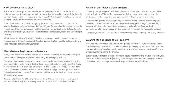
A reusable block of formatted copy, used wherever a component offers a content slot.
| Field | Field ID | Type | Req. | Loc. | Rules and allowed values | Notes for editors |
|---|---|---|---|---|---|---|
| Market | vileda | JSON object (app) | Yes | No | Set through the Market field app. | Assigns the entry to the market or markets it belongs to. Mandatory on almost every content type – pick the markets in the app interface rather than editing the JSON. |
| Internal Name | internalName | Short text (Symbol) | Yes | No | Free text. | Editorial working title. Not shown on the website; it is the entry title in lists, search and reference pickers. Use a clear, consistent pattern, e.g. “PLP | Mops | Highlight Card”. |
| Content | content | Rich text | Yes | Yes | Headings 2–6, ordered and unordered lists, bold, italic, underline. Links to URLs and Page entries. No embedded media. | The copy. Heading 1 is unavailable by design. Link to other pages with an entry link rather than a hard-coded URL so the link survives slug changes. |
4. Tag
Name in Contentful: 🏷️ Tag Content type ID: tag Entry title: internalName
Specification:CS-356 (QA Testing on S1), CS-458 (Done)
A small reusable label that classifies a piece of content, for example “Guide” or “Routine”. Tags are referenced by cards and other content components instead of being typed in each time, so the same wording is used everywhere.
| Field | Field ID | Type | Req. | Loc. | Rules and allowed values | Notes for editors |
|---|---|---|---|---|---|---|
| Market | vileda | JSON object (app) | Yes | No | Set through the Market field app. | Assigns the entry to the market or markets it belongs to. Mandatory on almost every content type – pick the markets in the app interface rather than editing the JSON. |
| Internal Name | internalName | Short text (Symbol) | Yes | No | Free text. | Editorial working title. Not shown on the website; it is the entry title in lists, search and reference pickers. Use a clear, consistent pattern, e.g. “PLP | Mops | Highlight Card”. |
| Label | label | Short text (Symbol) | Yes | Yes | Maximum 30 characters. | The visible tag text. Keep it to one or two words so it fits on a card. |
| Icon | icon | Short text (Symbol) | No | No | Article, Routine, Guide or Community. | Optional icon shown with the label. Pick the one that matches the kind of content, or leave it empty for a plain text tag. |
5. Image
Name in Contentful: ⚙️ Image Content type ID: image Entry title: internalName
Specification:CS-268 (Done), CS-27 (Done)
The current image element for every component that shows a picture. The asset is not uploaded into Contentful but picked from Celum, the DAM, through the Media field app, so the same source image is reused everywhere and the frontend derives the aspect ratio and resolution each component and screen size needs.
| Field | Field ID | Type | Req. | Loc. | Rules and allowed values | Notes for editors |
|---|---|---|---|---|---|---|
| Market | vileda | JSON object (app) | Yes | No | Set through the Market field app. | Assigns the entry to the market or markets it belongs to. Mandatory on almost every content type – pick the markets in the app interface rather than editing the JSON. |
| Internal Name | internalName | Short text (Symbol) | Yes | No | Free text. | Editorial working title. Not shown on the website; it is the entry title in lists, search and reference pickers. Use a clear, consistent pattern, e.g. “PLP | Mops | Highlight Card”. |
| Image | image | JSON object (app) | Yes | Yes | Set through the Media (Celum) field app. | Pick the asset in the app interface, do not edit the JSON. Because the field is localised, each language can use its own visual. |
| Alt Text | altText | Short text (Symbol) | No | Yes | Free text. | Describe what the image shows. Required for accessibility and SEO in practice, even though the field is technically optional. Leave empty only for purely decorative images. |
| Mobile Image | mobileImage | JSON object (app) | No | Yes | Set through the Media (Celum) field app. | Optional alternative crop for small screens. If empty, the desktop image is used. |
| Mobile Alt Text | mobileAltText | Short text (Symbol) | No | Yes | Free text. | Only needed when the mobile image shows something different from the desktop image. |
Editorial notes
- Only Celum assets that match the filters set by the admins appear in the picker. Upload new images in Celum first, then select them here.
- A focal point must be set before an image can be referenced – the app blocks the selection otherwise.
- Alt text is technically optional, so nothing stops you publishing without it. Fill it.
6. Video
Name in Contentful: ⚙️ Video Content type ID: video Entry title: internalName
Specification:CS-30 (QA Testing on S1), CS-350 (Done), CS-308 (Done)
The reusable video element for the media gallery on product detail pages and for content pages, shown next to images in the grid and in the full-size lightbox. Videos are hosted on Ignite and embedded through its player; the editor selects one in the picker by title, category or tag.
| Field | Field ID | Type | Req. | Loc. | Rules and allowed values | Notes for editors |
|---|---|---|---|---|---|---|
| Market | vileda | JSON object (app) | Yes | No | Set through the Market field app. | Assigns the entry to the market or markets it belongs to. Mandatory on almost every content type – pick the markets in the app interface rather than editing the JSON. |
| Internal Name | internalName | Short text (Symbol) | Yes | No | Free text. | Editorial working title. Not shown on the website; it is the entry title in lists, search and reference pickers. Use a clear, consistent pattern, e.g. “PLP | Mops | Highlight Card”. |
| Video | video | JSON object (app) | Yes | Yes | Set through the Media (Ignite) field app. | Select the video in the app interface. Localised, so each language can reference its own version. |
Editorial notes
- Thumbnail, aspect ratio, orientation and alt text are read from Ignite and are not editable here.
- Supporting text and captions appear only in the full-size view, never in the gallery view.
- Choose the grid layout that matches the asset's shape – container ratios are fixed and will not adapt.
- A video copied from Celum into Ignite is not updated automatically when the Celum source changes.
7. Media (deprecated)
Name in Contentful: Media (deprecated) Content type ID: media Entry title: internalName
Specification:CS-268 (Done)
Legacy – superseded by Image and Video
The original combined media element holding either an image or a video, superseded by the separate Image and Video types. Header Promotion Item, Sub-Category Card, the footer payment logos and the PDP gallery still accept it, so existing entries keep working. Create new content with Image or Video.
| Field | Field ID | Type | Req. | Loc. | Rules and allowed values | Notes for editors |
|---|---|---|---|---|---|---|
| Market | vileda | JSON object (app) | Yes | No | Set through the Market field app. | Assigns the entry to the market or markets it belongs to. Mandatory on almost every content type – pick the markets in the app interface rather than editing the JSON. |
| Internal Name | internalName | Short text (Symbol) | Yes | No | Free text. | Editorial working title. Not shown on the website; it is the entry title in lists, search and reference pickers. Use a clear, consistent pattern, e.g. “PLP | Mops | Highlight Card”. |
| Media Type | mediaType | Short text (Symbol) | Yes | No | Image or Video. | Decides which of the fields below are relevant. Fill only the matching ones. |
| Desktop Image | desktopImage | Reference (asset) | No | No | Any asset. | Image uploaded directly into Contentful. Use either this or the Celum ID, not both. |
| Desktop Celum Image ID | desktopCelumImageId | Short text (Symbol) | No | No | Free text. | Asset ID from Celum. Copy it from the DAM. |
| Desktop Alt Text | desktopAltText | Short text (Symbol) | No | Yes | Free text. | Alternative text for the desktop image. |
| Mobile Image | mobileImage | Reference (asset) | No | No | Any asset. | Optional mobile crop uploaded into Contentful. |
| Mobile Celum Image ID | mobileCelumImageId | Short text (Symbol) | No | No | Free text. | Celum asset ID of the mobile crop. |
| Mobile Alt Text | mobileAltText | Short text (Symbol) | No | Yes | Free text. | Alternative text for the mobile image. |
| Ignite Video ID | igniteVideoId | Short text (Symbol) | No | No | Free text. | Video ID from Ignite. Only relevant when Media Type is Video. |
Editorial notes
- Do not create new Media entries – use Image or Video, which are wired to the Celum and Ignite field apps.
8. Document
Name in Contentful: ⚙️ Document Content type ID: document Entry title: internalName
Specification:CS-72 (Clarification), CS-417 (Done)
Design:Action Card (Playbook V01) · PDP prototype (Diseño v03)
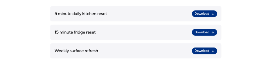
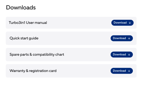
A downloadable product document such as a safety instruction, user manual or data sheet. Its main home is the product detail page, embedded inside the PDP accordion rows; it is also intended for content pages where a general download is needed. Files are referenced from the CMS or the DAM rather than by pasting SAP Commerce media URLs.
| Field | Field ID | Type | Req. | Loc. | Rules and allowed values | Notes for editors |
|---|---|---|---|---|---|---|
| Market | vileda | JSON object (app) | Yes | No | Set through the Market field app. | Assigns the entry to the market or markets it belongs to. Mandatory on almost every content type – pick the markets in the app interface rather than editing the JSON. |
| Internal Name | internalName | Short text (Symbol) | Yes | No | Free text. | Editorial working title. Not shown on the website; it is the entry title in lists, search and reference pickers. Use a clear, consistent pattern, e.g. “PLP | Mops | Highlight Card”. |
| Title | title | Short text (Symbol) | Yes | Yes | Free text, maximum 120 characters. | The download label shown to users. |
| Document Type | documentType | Short text (Symbol) | Yes | No | Safety Instructions, User Manual, Data Sheet. | Classifies the document; controls grouping and the icon. |
| File (deprecated, use “Document” instead) | file | Reference (asset) | No | Yes | PDF, rich-text or plain-text assets only. | Deprecated and no longer mandatory. Older entries may still hold a file here; for anything new, upload through the Document field instead and leave this one empty. |
| Document | asset | JSON object (app) | Yes | Yes | Set through the media field app, restricted to PDF. | The actual file, picked in the media app. Localised, so each language has its own version of the file. |
Editorial notes
- Keep the title to one line, two at most – the field additionally enforces 120 characters.
- Horizontal or vertical layout is chosen automatically by container width and title length.
- Only the button is clickable; the card itself is not a link.
9. Breadcrumb Item
Name in Contentful: ⚙️ Breadcrumb Item Content type ID: breadcrumbItem Entry title: internalName
Specification:CS-209 (Vileda QA on S1)
Design:Breadcrumb (Playbook V02)
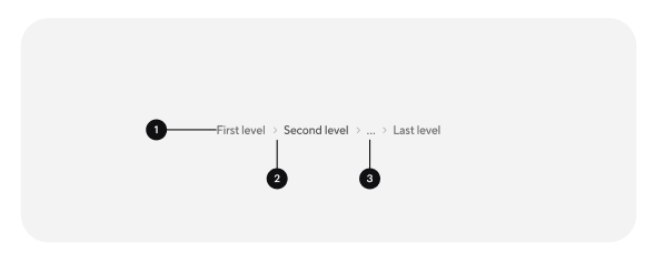
One segment of the breadcrumb trail showing where a page sits in the hierarchy. Breadcrumbs appear on pages below the top level – category, product detail and content pages – but never on the homepage. The trail is maintained manually on the Page entry and is not derived from the navigation.

| Field | Field ID | Type | Req. | Loc. | Rules and allowed values | Notes for editors |
|---|---|---|---|---|---|---|
| Market | vileda | JSON object (app) | Yes | No | Set through the Market field app. | Assigns the entry to the market or markets it belongs to. Mandatory on almost every content type – pick the markets in the app interface rather than editing the JSON. |
| Internal Name | internalName | Short text (Symbol) | Yes | No | Free text. | Editorial working title. Not shown on the website; it is the entry title in lists, search and reference pickers. Use a clear, consistent pattern, e.g. “PLP | Mops | Highlight Card”. |
| Label | label | Short text (Symbol) | Yes | Yes | Maximum 40 characters. | Segment text. The interface truncates at 24 characters with an ellipsis, so keep it well below the limit. |
| Page | page | Reference (entry) | No | No | Page entries only. | The page this segment links to. Leave empty on the last segment – the current page is not a link. |
Editorial notes
- Leave the Page reference empty on the last item; the current page is rendered as plain text.
- Home and the current page are not separate levels, so about three intermediate items are normally visible.
- Separators and the “…” overflow for long paths are added automatically.
- A page may appear in only one trail – it cannot hang under two navigation parents.