
Content model reference
Components
Components are the modules you place into the component list of a page body, plus the two global frames (header and footer) and their building blocks. They are reusable: the same entry can be referenced from several pages, and editing it changes all of them.
1. Header
Name in Contentful: 🧩 Header Content type ID: header Entry title: internalName
Specification:CS-124 (Vileda QA on S1), CS-433 (Ready for P1), CS-539 (Done)
Design:Header (Playbook V02) · Header prototype (Diseño v03)
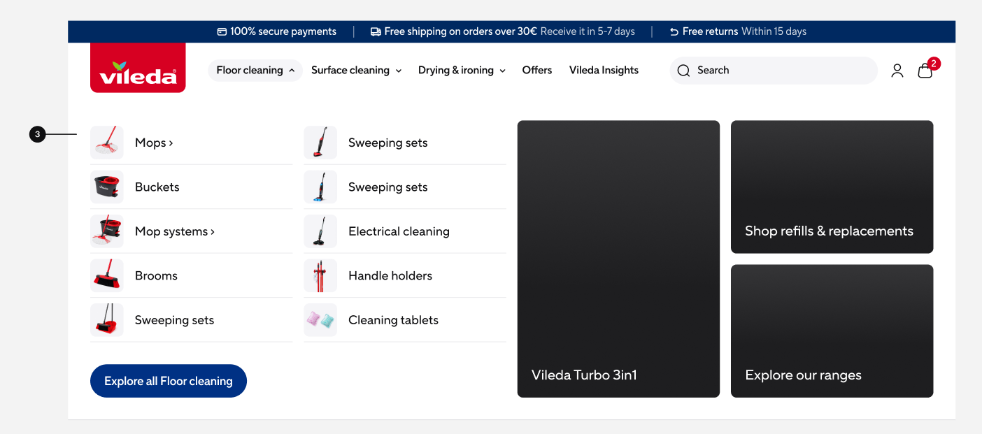
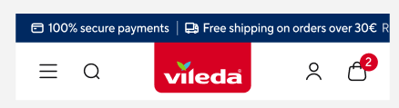
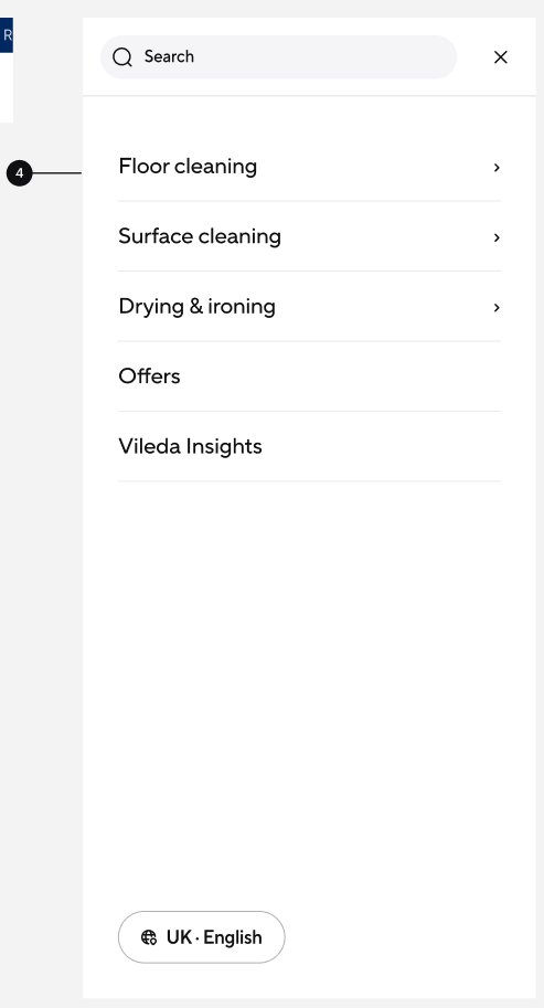
The global site header at the top of every page, referenced by every Page entry. It holds the logo, the main navigation with its mega-menu and an optional info bar for site-wide messages such as free returns. Normally one entry per market, so every change here affects the whole site.

| Field | Field ID | Type | Req. | Loc. | Rules and allowed values | Notes for editors |
|---|---|---|---|---|---|---|
| Market | vileda | JSON object (app) | Yes | No | Set through the Market field app. | Assigns the entry to the market or markets it belongs to. Mandatory on almost every content type – pick the markets in the app interface rather than editing the JSON. |
| Internal Name | internalName | Short text (Symbol) | Yes | No | Free text. | Editorial working title. Not shown on the website; it is the entry title in lists, search and reference pickers. Use a clear, consistent pattern, e.g. “PLP | Mops | Highlight Card”. |
| Logo (deprecated) | logo | Reference (asset) | No | No | Any asset. | Deprecated. New entries use the Logo field below, which points to an Image entry. Leave this one empty. |
| Logo | logoAsset | Reference (entry) | Yes | No | Image entries only. | Brand logo in the header. Use the approved SVG. |
| Logo URL | logoUrl | Reference (entry) | Yes | No | Link entries only. | Where the logo points – normally the market homepage. |
| Info Bar Items | infoBarItems | List of references (entries) | No | No | Header Info Bar Item entries. Maximum 3. | The thin promotional bar above the navigation. Leave empty to hide the bar. |
| Navigation Items | navigationItems | List of references (entries) | No | No | Header Navigation Item entries only. | Top level of the main navigation, in display order. Sub-levels are nested inside each item. |
Editorial notes
- The info bar takes a maximum of three items; a fourth cannot be added.
- Info bar text starts scrolling only when the items are wider than the bar – the frontend decides this.
- Light and dark appearance, the transparent state over the homepage hero and the expanded versus compact layout are all automatic.
- Search, account and cart icons are frontend features; website markets get a country selector instead of account and cart.
2. Header Info Bar Item
Name in Contentful: 🧩 Header Info Bar Item Content type ID: headerInfoBarItem Entry title: internalName
Specification:CS-124 (Vileda QA on S1), CS-433 (Ready for P1)
One rotating message in the info bar above the main header, used for site-wide notices such as free shipping or a campaign note. Up to three items are shown, separated by dividers.

| Field | Field ID | Type | Req. | Loc. | Rules and allowed values | Notes for editors |
|---|---|---|---|---|---|---|
| Market | vileda | JSON object (app) | Yes | No | Set through the Market field app. | Assigns the entry to the market or markets it belongs to. Mandatory on almost every content type – pick the markets in the app interface rather than editing the JSON. |
| Internal Name | internalName | Short text (Symbol) | Yes | No | Free text. | Editorial working title. Not shown on the website; it is the entry title in lists, search and reference pickers. Use a clear, consistent pattern, e.g. “PLP | Mops | Highlight Card”. |
| Text | text | Rich text | Yes | Yes | Bold only. Embedded assets and inline entries allowed; inline entries are restricted to mediaTest and image entries. No links, headings or lists. | One short sentence. Long text is truncated on mobile. |
Editorial notes
- The field is rich text but only bold is available; an icon has to be placed as an embedded asset in the text.
- Links, headings and lists are not permitted here.
4. Header Promotion Item
Name in Contentful: 🧩 Header Promotion Item Content type ID: headerPromotionItem Entry title: internalName
Specification:CS-68 (Scope Rejected)
A visual teaser inside a mega-menu column of the header, combining a label, an image and a target page. It is placed in one of the four column lists of a Header Navigation Item, alongside ordinary navigation items, up to five entries per column.
| Field | Field ID | Type | Req. | Loc. | Rules and allowed values | Notes for editors |
|---|---|---|---|---|---|---|
| Market | vileda | JSON object (app) | Yes | No | Set through the Market field app. | Assigns the entry to the market or markets it belongs to. Mandatory on almost every content type – pick the markets in the app interface rather than editing the JSON. |
| Internal Name | internalName | Short text (Symbol) | Yes | No | Free text. | Editorial working title. Not shown on the website; it is the entry title in lists, search and reference pickers. Use a clear, consistent pattern, e.g. “PLP | Mops | Highlight Card”. |
| Label | label | Short text (Symbol) | Yes | Yes | Free text. | Caption under or over the image. |
| Image | image | Reference (entry) | Yes | No | Media or Image entries. | Teaser visual. Use the Image type for new content. |
| Page | page | Reference (entry) | Yes | No | Page entries only. | Target of the tile. |
Editorial notes
- Label, image and page are all mandatory – a partial teaser cannot be saved.
- The image slot still accepts legacy Media entries; use Image for new content.
5. Footer
Name in Contentful: 🧩 Footer Content type ID: footer Entry title: internalName
Specification:CS-125 (QA Testing on S1), CS-83 (Scope Rejected)
Design:Footer (Playbook V02)
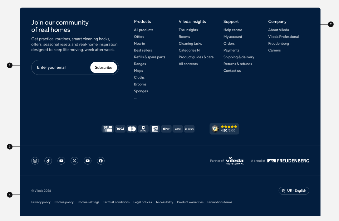
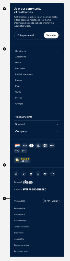
The global site footer, shown on every page and referenced by every Page entry. It consists of four zones: the newsletter sign-up, the navigation link columns, the brand, partner, payment and social area, and the legal line. Normally one entry per market.
| Field | Field ID | Type | Req. | Loc. | Rules and allowed values | Notes for editors |
|---|---|---|---|---|---|---|
| Market | vileda | JSON object (app) | Yes | No | Set through the Market field app. | Assigns the entry to the market or markets it belongs to. Mandatory on almost every content type – pick the markets in the app interface rather than editing the JSON. |
| Internal Name | internalName | Short text (Symbol) | Yes | No | Free text. | Editorial working title. Not shown on the website; it is the entry title in lists, search and reference pickers. Use a clear, consistent pattern, e.g. “PLP | Mops | Highlight Card”. |
| Newsletter Headline Title | newsletterHeadlineTitle | Short text (Symbol) | Yes | Yes | Free text. | Headline of the newsletter zone. |
| Newsletter Headline Text | newsletterHeadlineText | Long text (Text) | No | Yes | Plain text, several lines allowed. | Supporting copy under the newsletter headline. |
| Newsletter Input Label | newsletterInputLabel | Short text (Symbol) | Yes | Yes | Free text. | Label of the e-mail input, e.g. “Your e-mail address”. |
| Newsletter Button Label | newsletterButtonLabel | Short text (Symbol) | Yes | Yes | Free text. | Label of the submit button. |
| Newsletter Form | newsletterForm | JSON object (app) | No | Yes | Set through the HubSpot field app. | Select the HubSpot form in the app – do not edit the raw JSON. |
| Navigation Columns | navigationColumns | List of references (entries) | Yes | No | Footer Navigation Column entries only. | Link columns, left to right. |
| Payment Logos | paymentLogos | List of references (entries) | No | No | Media or Image entries. | Accepted payment methods. Must match what checkout actually offers in this market. |
| Social Links | socialLinks | List of references (entries) | No | No | Social Link entries only. | Social channel icons, in display order. |
| Partner Text | partnerText | Rich text | No | Yes | Links to URLs and Page entries, inline entries and embedded assets. No bold, italic or underline. | Partner or certification note. |
| Brand Text | brandText | Rich text | No | Yes | Links to URLs and Page entries, inline entries and embedded assets. No bold, italic or underline. | Short brand or company statement. |
| Copyright Text | copyrightText | Short text (Symbol) | Yes | Yes | Free text. | Copyright line. Remember to update the year. |
| Legal Links | legalLinks | List of references (entries) | Yes | No | Link entries only. | Imprint, privacy policy, terms, cookie settings. Legally required – check with the local legal contact before changing. |
Editorial notes
- Newsletter headline title, input label, button label, copyright text and legal links are all mandatory.
- The newsletter form is selected through the HubSpot field app, not typed in by hand.
- Partner Text and Brand Text allow links and embedded content but no bold, italic or underline.
- On mobile the navigation columns turn into an accordion; this is frontend behaviour and not configurable.
7. Accordion
Name in Contentful: 🧩 Accordion Content type ID: accordion Entry title: internalName
Specification:CS-139 (QA Testing on S1)
Design:Accordion (Playbook V02)
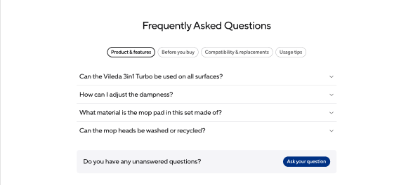
A vertically stacked group of expandable rows that keeps pages short and reduces scrolling, especially on mobile. Used for FAQs on product detail pages, for Help & Support pages and for product listing page filters. This entry holds the group; the rows are separate Accordion Item entries.
| Field | Field ID | Type | Req. | Loc. | Rules and allowed values | Notes for editors |
|---|---|---|---|---|---|---|
| Market | vileda | JSON object (app) | Yes | No | Set through the Market field app. | Assigns the entry to the market or markets it belongs to. Mandatory on almost every content type – pick the markets in the app interface rather than editing the JSON. |
| Internal Name | internalName | Short text (Symbol) | Yes | No | Free text. | Editorial working title. Not shown on the website; it is the entry title in lists, search and reference pickers. Use a clear, consistent pattern, e.g. “PLP | Mops | Highlight Card”. |
| Items | items | List of references (entries) | Yes | No | Accordion Item entries only. | The rows, in display order. At least one is required. |
| Anchor | anchor | Short text (Symbol) | No | Yes | Lower-case letters, digits and hyphens only, e.g. how-to-use. | Optional anchor id so this module can be jumped to directly and listed in an anchor navigation. Leave empty when the module is not a jump target. |
| Anchor Label | anchorLabel | Short text (Symbol) | No | Yes | Free text. | The text shown for this anchor in an anchor navigation. Only needed when Anchor is filled. |
| Anchor Icon | anchorIcon | Reference (entry) | No | No | Image entries only. | Optional icon shown next to the anchor label in an anchor navigation. |
Editorial notes
- The size variant (MD by default, SM in sidebars and PLP filters) is chosen automatically by the frontend.
- All items are collapsed on page load – you cannot pre-open a row.
8. Accordion Item
Name in Contentful: 🧩 Accordion Item Content type ID: accordionItem Entry title: internalName
Specification:CS-139 (QA Testing on S1)
Design:Accordion (Playbook V02)
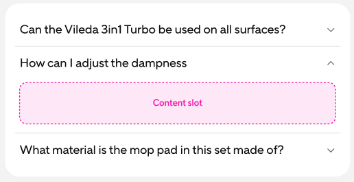
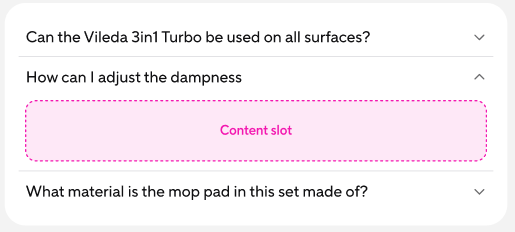
One expandable row inside an Accordion. It carries the title shown in both the closed and the open state plus a content slot for the body – a single FAQ question, or one block of long SEO text.
| Field | Field ID | Type | Req. | Loc. | Rules and allowed values | Notes for editors |
|---|---|---|---|---|---|---|
| Market | vileda | JSON object (app) | Yes | No | Set through the Market field app. | Assigns the entry to the market or markets it belongs to. Mandatory on almost every content type – pick the markets in the app interface rather than editing the JSON. |
| Internal Name | internalName | Short text (Symbol) | Yes | No | Free text. | Editorial working title. Not shown on the website; it is the entry title in lists, search and reference pickers. Use a clear, consistent pattern, e.g. “PLP | Mops | Highlight Card”. |
| Title | title | Short text (Symbol) | Yes | Yes | Free text. | The always-visible row label – in an FAQ, the question. |
| Content Slot | content | List of references (entries) | Yes | No | Text, Media, Image, Link or Button entries. | The revealed content, in display order. Use a Text entry for copy and add Image, Link or Button entries as needed. |
Editorial notes
- The title is visible in both states, so write it as a self-explanatory question or label.
- Combine several entries in the content slot for a richer answer, e.g. text plus a button.
9. Hero
Name in Contentful: 🧩 Hero Content type ID: hero Entry title: internalName
Specification:CS-160 (In Progress)
Design:Hero (Playbook V02) · Hero (Playbook V01)
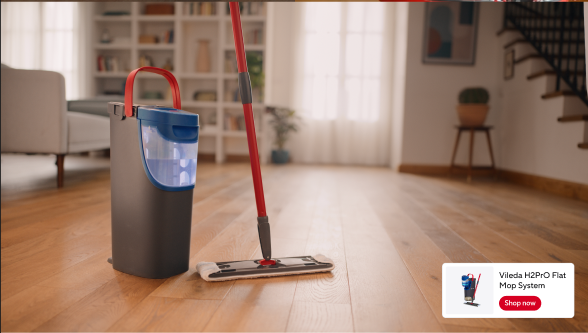
The full-bleed stage at the top of a page, always the first module. The standard hero carries an optional background image or video, tags, a title, supporting text, a call to action and an optional product card. A full-screen snapping variant, where panels fill the viewport and slide over each other on scroll, is reserved for the homepage.
| Field | Field ID | Type | Req. | Loc. | Rules and allowed values | Notes for editors |
|---|---|---|---|---|---|---|
| Market | vileda | JSON object (app) | Yes | No | Set through the Market field app. | Assigns the entry to the market or markets it belongs to. Mandatory on almost every content type – pick the markets in the app interface rather than editing the JSON. |
| Internal Name | internalName | Short text (Symbol) | Yes | No | Free text. | Editorial working title. Not shown on the website; it is the entry title in lists, search and reference pickers. Use a clear, consistent pattern, e.g. “PLP | Mops | Highlight Card”. |
| Variant | variant | Short text (Symbol) | Yes | No | Standard or Full-screen Snapping. | Standard is the normal banner. Use Full-screen Snapping only where the design for this page asks for it. |
| Background Type | backgroundType | Short text (Symbol) | Yes | No | Image or None. | Choose None for a hero without a visual; Background Media then stays empty. |
| Background Media | backgroundMedia | Reference (entry) | No | No | Image or Video entries. | The background visual, only relevant when Background Type is Image. Check that the headline stays readable on top of it. |
| Alignment | alignment | Short text (Symbol) | No | No | Left or Center. | Where the text block sits inside the hero. |
| Tags | tags | List of references (entries) | No | No | Tag entries only. | Small labels above the headline, e.g. a campaign or category tag. Leave empty when not needed. |
| Title | title | Short text (Symbol) | Yes | Yes | Free text. | The main hero headline. Keep it short – it is displayed very large. |
| Subtitle | subtitle | Short text (Symbol) | No | Yes | Free text. | One supporting line below the headline. |
| CTA | cta | Reference (entry) | No | No | Button entries only. | The main call to action of the hero. One button is normally enough. |
| Product Card | productCard | Reference (entry) | No | No | Product Card entries only. | Optional product teaser inside the hero, e.g. the campaign product. |
| Show Carousel | showCarousel | Boolean | No | No | Yes / No. | Shows the hero in its carousel presentation. Leave it off unless the design for this page asks for it. |
| Quick Links | quickLinks | List of references (entries) | No | No | Link entries only. | Shortcut links below the hero content, in display order. |
| Anchor | anchor | Short text (Symbol) | No | Yes | Lower-case letters, digits and hyphens only, e.g. how-to-use. | Optional anchor id so this module can be jumped to directly and listed in an anchor navigation. Leave empty when the module is not a jump target. |
| Anchor Label | anchorLabel | Short text (Symbol) | No | Yes | Free text. | The text shown for this anchor in an anchor navigation. Only needed when Anchor is filled. |
| Anchor Icon | anchorIcon | Reference (entry) | No | No | Image entries only. | Optional icon shown next to the anchor label in an anchor navigation. |
Editorial notes
- Supply high-resolution background media – it is displayed full-bleed and loses quality at viewport width.
- Background videos autoplay muted and looped; the pause control is added by the frontend.
- Left/centre alignment only takes effect on desktop without a background; mobile is always left-aligned.
10. Headline
Name in Contentful: 🧩 Headline Content type ID: headline Entry title: internalName
Specification:CS-150 (QA Testing on S1)
Design:Headline (Playbook V02)
A reusable typographic anchor with a title plus optional subtitle, description and call to action. It is meant for section intros, banners and the inside of a hero, and sets the content hierarchy for everything that follows.

| Field | Field ID | Type | Req. | Loc. | Rules and allowed values | Notes for editors |
|---|---|---|---|---|---|---|
| Market | vileda | JSON object (app) | Yes | No | Set through the Market field app. | Assigns the entry to the market or markets it belongs to. Mandatory on almost every content type – pick the markets in the app interface rather than editing the JSON. |
| Internal Name | internalName | Short text (Symbol) | Yes | No | Free text. | Editorial working title. Not shown on the website; it is the entry title in lists, search and reference pickers. Use a clear, consistent pattern, e.g. “PLP | Mops | Highlight Card”. |
| Title | title | Short text (Symbol) | Yes | Yes | Free text. | The visible heading of the section. Keep it short and descriptive. |
| Subtitle | subtitle | Short text (Symbol) | No | Yes | Free text. | Optional supporting line. Leave empty when the title stands on its own. |
| Description | description | Rich text | No | Yes | No restrictions: all formatting options of the rich text editor are available. | Introductory copy below the headline. Keep it to a short paragraph – and avoid Heading 1 here, the page headline is the only H1. |
| CTA | cta | Reference (entry) | No | No | Button entries only. | Optional call to action below the text. |
| Hierarchy | hierarchy | Short text (Symbol) | Yes | No | Display 1, Display 2, Display 3. | Visual size of the headline. Reserve Display 1 for the most important section of a page. |
| Align | align | Short text (Symbol) | Yes | No | Left or Center. | Alignment of the whole block. Keep it consistent across a page. |
| Anchor | anchor | Short text (Symbol) | No | Yes | Lower-case letters, digits and hyphens only, e.g. how-to-use. | Optional anchor id so this module can be jumped to directly and listed in an anchor navigation. Leave empty when the module is not a jump target. |
| Anchor Label | anchorLabel | Short text (Symbol) | No | Yes | Free text. | The text shown for this anchor in an anchor navigation. Only needed when Anchor is filled. |
| Anchor Icon | anchorIcon | Reference (entry) | No | No | Image entries only. | Optional icon shown next to the anchor label in an anchor navigation. |
Editorial notes
- Choose the hierarchy from the page's information architecture, not from the visual size.
- Use only one Display 1 (H1) per page; Display 2 and 3 may repeat as often as the structure requires.
- Nothing validates the one-H1 rule – it is an editorial responsibility.
- Centre alignment reduces readability on narrow viewports; prefer left inside containers with other content.
11. Headline Card
Name in Contentful: 🧩 Headline Card Content type ID: headlineCard Entry title: internalName
Specification:CS-282 (QA Testing on S1), CS-524 (Done); CS-151 (Scope Rejected)
An editorial card used inside card collections. It holds a title, an optional subtitle and one line of copy, plus an optional call-to-action button. The look is set per card: an image, dark or light background, the image layout and where the button sits.
| Field | Field ID | Type | Req. | Loc. | Rules and allowed values | Notes for editors |
|---|---|---|---|---|---|---|
| Market | vileda | JSON object (app) | Yes | No | Set through the Market field app. | Assigns the entry to the market or markets it belongs to. Mandatory on almost every content type – pick the markets in the app interface rather than editing the JSON. |
| Internal Name | internalName | Short text (Symbol) | Yes | No | Free text. | Editorial working title. Not shown on the website; it is the entry title in lists, search and reference pickers. Use a clear, consistent pattern, e.g. “PLP | Mops | Highlight Card”. |
| Title | title | Short text (Symbol) | Yes | Yes | Free text. | Card headline. Keep it short – cards are narrow. |
| Subtitle | subtitle | Short text (Symbol) | No | Yes | Free text. | Optional supporting line. Leave empty when the title says enough. |
| Description | description | Short text (Symbol) | No | Yes | Free text. | One line of supporting copy. This is a short-text field, so it is not meant for a full paragraph. |
| CTA Button | cta | Reference (entry) | No | No | Button entries only. | Optional call to action on the card. Reuse an existing Button entry where one fits. |
| Background | background | Short text (Symbol) | Yes | No | Image, Dark or Light. | Decides the look of the card. Pick Image only when you also set a Background Image. |
| Background Image | backgroundImage | Reference (entry) | No | No | Image entries only. | The card visual. Needed in practice when Background is Image, even though the field is technically optional. |
| Image Layout | imageLayout | Short text (Symbol) | No | No | Full or Split. | Full uses the image across the whole card, Split puts it next to the text. Only relevant when Background is Image. |
| Button Alignment | buttonAlignment | Short text (Symbol) | No | No | Top or Fill. | Where the button sits in the card. Only relevant when a CTA Button is set. |
12. Content Card
Name in Contentful: 🧩 Content Card Content type ID: contentCard Entry title: internalName
Specification:CS-281 (QA Testing on S1), CS-149 (Scope Rejected)
Design:Content Card (Playbook V01) · Tags (Playbook V02)
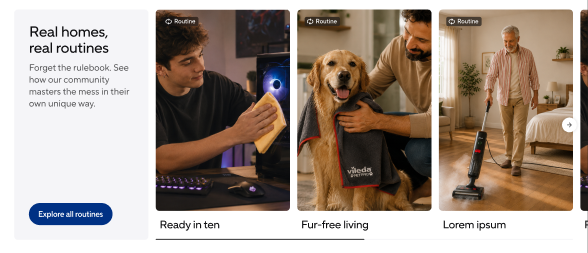
A flexible image-and-text card combining a picture or video with editorial content. It is used in the Vileda Insights grid and carousels for articles, routines, guides and community videos, and in campaign, editorial, bento and masonry modules. Cards always appear as part of a collection, never on their own.
| Field | Field ID | Type | Req. | Loc. | Rules and allowed values | Notes for editors |
|---|---|---|---|---|---|---|
| Market | vileda | JSON object (app) | Yes | No | Set through the Market field app. | Assigns the entry to the market or markets it belongs to. Mandatory on almost every content type – pick the markets in the app interface rather than editing the JSON. |
| Internal Name | internalName | Short text (Symbol) | Yes | No | Free text. | Editorial working title. Not shown on the website; it is the entry title in lists, search and reference pickers. Use a clear, consistent pattern, e.g. “PLP | Mops | Highlight Card”. |
| Media | media | Reference (entry) | Yes | No | Image or Video entries. | The card visual. Mandatory – the card cannot be published without it. |
| Tags | tags | List of references (entries) | No | No | Tag entries only. Maximum 2. | Optional labels on the card, e.g. a category or a campaign. Two is the hard limit, so pick the two that really help the user. |
| Title | title | Short text (Symbol) | Yes | Yes | Free text. | The card headline. Keep it short – cards are narrow and long titles wrap over several lines. |
| Description | description | Short text (Symbol) | No | Yes | Free text. | One or two supporting sentences below the title. Leave empty for image-led cards. |
| CTA Icon Button | ctaIconButton | Reference (entry) | No | No | Button entries only. | Optional call to action on the card. Reference a Button entry that carries the label and the target. |
| Content Overlaid | contentOverlaid | Boolean | Yes | No | Yes / No. | Decides whether title and text sit on top of the visual or below it. Check the result on mobile – text over a busy image quickly becomes unreadable. |
| Use Container | useContainer | Boolean | No | No | Yes / No. | Yes: the video scales to fill the whole display area. There are no side margins, but parts of the content may be cropped. The opposite of Use Fixed Ratio. |
| Use Fixed Ratio | useFixedRatio | Boolean | No | No | Yes / No. | Yes: the video keeps its fixed ratio, so the whole content stays visible, but margins may appear at the sides. The opposite of Use Container. |
Editorial notes
- Always fill at least a title; the whole card surface is clickable, so a button is optional reinforcement.
- Omit the CTA icon button on cards that lead to Vileda Insights content, where the destination is self-evident.
- Do not mix different card configurations within one carousel or grid row.
13. Product Card
Name in Contentful: 🧩 Product Card Content type ID: productCard Entry title: internalName
Specification:CS-154 (QA Testing on S1), CS-545 (Done)
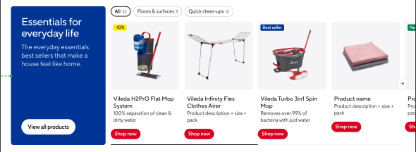
A card that promotes one product from the SAP product catalogue. The entry itself only carries the product code; name, image and price are pulled from SAP when the page is rendered.
| Field | Field ID | Type | Req. | Loc. | Rules and allowed values | Notes for editors |
|---|---|---|---|---|---|---|
| Market | vileda | JSON object (app) | Yes | No | Set through the Market field app. | Assigns the entry to the market or markets it belongs to. Mandatory on almost every content type – pick the markets in the app interface rather than editing the JSON. |
| Internal Name | internalName | Short text (Symbol) | Yes | No | Free text. | Editorial working title. Not shown on the website; it is the entry title in lists, search and reference pickers. Use a clear, consistent pattern, e.g. “PLP | Mops | Highlight Card”. |
| Product Code | productCode | Short text (Symbol) | Yes | No | Free text. | The SAP product code. This is the link to the commerce system – a typo here means the card shows no product data. Copy it from SAP, never type it from memory. |
14. Card Collection
Name in Contentful: 🧩 Card Collection Content type ID: cardCollection Entry title: internalTitle
Specification:CS-157 (Clarification), CS-225 (Done); planned content variants CS-294, CS-295, CS-296
The wrapper around a group of cards. It holds no cards itself: you reference one of the three Card Collection layout entries, and the cards live there. Always add the Card Collection to a page component list, never the layout entry on its own.
| Field | Field ID | Type | Req. | Loc. | Rules and allowed values | Notes for editors |
|---|---|---|---|---|---|---|
| Market | vileda | JSON object (app) | Yes | No | Set through the Market field app. | Assigns the entry to the market or markets it belongs to. Mandatory on almost every content type – pick the markets in the app interface rather than editing the JSON. |
| Internal Title | internalTitle | Short text (Symbol) | Yes | No | Free text. | Editorial working title. Not shown on the website; it is the entry title in lists, search and reference pickers. Use a clear, consistent pattern, e.g. “PLP | Mops | Highlight Card”. |
| Layout | layout | Reference (entry) | Yes | No | Card Collection — Grid, Card Collection — Media Large + Stacked or Card Collection — Fixed + Content entries. | Pick the layout entry that holds the cards. Changing the layout later means creating a different layout entry and re-adding the cards, so agree the layout before you start filling it. |
| Anchor | anchor | Short text (Symbol) | No | Yes | Lower-case letters, digits and hyphens only, e.g. how-to-use. | Optional anchor id so this module can be jumped to directly and listed in an anchor navigation. Leave empty when the module is not a jump target. |
| Anchor Label | anchorLabel | Short text (Symbol) | No | Yes | Free text. | The text shown for this anchor in an anchor navigation. Only needed when Anchor is filled. |
| Anchor Icon | anchorIcon | Reference (entry) | No | No | Image entries only. | Optional icon shown next to the anchor label in an anchor navigation. |
15. Card Collection — Grid
Name in Contentful: 🧩 Card Collection — Grid Content type ID: cardCollectionGrid Entry title: internalTitle
Specification:CS-157 (Clarification), CS-225 (Done)
The Grid layout of a Card Collection: cards in an even grid of three, four, five or six columns. Reference it from a Card Collection entry rather than adding it to a page directly.
| Field | Field ID | Type | Req. | Loc. | Rules and allowed values | Notes for editors |
|---|---|---|---|---|---|---|
| Market | vileda | JSON object (app) | Yes | No | Set through the Market field app. | Assigns the entry to the market or markets it belongs to. Mandatory on almost every content type – pick the markets in the app interface rather than editing the JSON. |
| Internal Title | internalTitle | Short text (Symbol) | Yes | No | Free text. | Editorial working title. Not shown on the website; it is the entry title in lists, search and reference pickers. Use a clear, consistent pattern, e.g. “PLP | Mops | Highlight Card”. |
| Columns (Desktop) | columns | Short text (Symbol) | Yes | No | 3, 4, 5, 6. | How many cards sit next to each other on desktop. Choose a number that divides your card count evenly so the last row is not half empty. |
| Cards | cards | List of references (entries) | Yes | No | Product Card, Content Card or Headline Card entries. | The cards in display order. Card types can be mixed, but a consistent mix looks calmer. |
| Disable Slider | disableSlider | Boolean | Yes | No | Yes / No. | Yes keeps the cards as a static grid, No lets them scroll as a slider. The field is mandatory, so make a deliberate choice. |
16. Card Collection — Media Large + Stacked
Name in Contentful: 🧩 Card Collection — Media Large + Stacked Content type ID: cardCollectionMediaLargeStacked Entry title: internalTitle
Specification:CS-157 (Clarification), CS-225 (Done)
The Media Large + Stacked layout of a Card Collection: one large visual beside a stack of product cards. Use it to pair a mood image or video with the products it shows. Reference it from a Card Collection entry rather than adding it to a page directly.
| Field | Field ID | Type | Req. | Loc. | Rules and allowed values | Notes for editors |
|---|---|---|---|---|---|---|
| Market | vileda | JSON object (app) | Yes | No | Set through the Market field app. | Assigns the entry to the market or markets it belongs to. Mandatory on almost every content type – pick the markets in the app interface rather than editing the JSON. |
| Internal Title | internalTitle | Short text (Symbol) | Yes | No | Free text. | Editorial working title. Not shown on the website; it is the entry title in lists, search and reference pickers. Use a clear, consistent pattern, e.g. “PLP | Mops | Highlight Card”. |
| Large Media | largeMedia | Reference (entry) | Yes | No | Image or Video entries. | The dominant visual of the block. Use a high-resolution asset – it is shown large. |
| Large Media Position | largeMediaPosition | Short text (Symbol) | Yes | No | Left, Right. | Which side the large visual sits on. Alternate it between blocks on the same page to keep the rhythm. |
| Top Card | topCard | Reference (entry) | No | No | Image, Video or Headline Card entries. | Optional card above the stack, typically a Headline Card introducing the products. |
| Bottom Cards | bottomCards | List of references (entries) | Yes | No | Product Card entries only. Minimum 1 item. | The stacked cards, in display order. Only Product Cards are allowed here. |
| Mobile Layout | mobileLayout | Short text (Symbol) | Yes | No | Aside, Stacked. | How the block reflows on small screens. Check the result on mobile before publishing. |
17. Card Collection — Fixed + Content
Name in Contentful: 🧩 Card Collection — Fixed + Content Content type ID: cardCollectionFixedContent Entry title: internalTitle
Specification:CS-157 (Clarification), CS-225 (Done)
The Fixed + Content layout of a Card Collection. A fixed Headline Card sits in one column and the other column shows media, downloads, accordions or cards. Reference it from a Card Collection entry rather than adding it to a page directly.
| Field | Field ID | Type | Req. | Loc. | Rules and allowed values | Notes for editors |
|---|---|---|---|---|---|---|
| Market | vileda | JSON object (app) | Yes | No | Set through the Market field app. | Assigns the entry to the market or markets it belongs to. Mandatory on almost every content type – pick the markets in the app interface rather than editing the JSON. |
| Internal Title | internalTitle | Short text (Symbol) | Yes | No | Free text. | Editorial working title. Not shown on the website; it is the entry title in lists, search and reference pickers. Use a clear, consistent pattern, e.g. “PLP | Mops | Highlight Card”. |
| Headline Card (Fixed Column) | headlineCard | Reference (entry) | Yes | No | Headline Card entries only. | The fixed column with the headline and intro copy. Mandatory in this layout. |
| Right Column Type | rightColumnType | Short text (Symbol) | Yes | No | Media, Downloads, Accordions, Carousel. | Decides which of the four right-column fields below is actually used. Fill only the matching one – the others stay empty. |
| Right Column Media | rightColumnMedia | Reference (entry) | No | No | Image or Video entries. | Used when Right Column Type is Media. A single image or video. |
| Right Column Downloads | rightColumnDownloads | List of references (entries) | No | No | Document entries only. | Used when Right Column Type is Downloads. The documents in display order, e.g. manuals or data sheets. |
| Right Column Accordions | rightColumnAccordions | List of references (entries) | No | No | Accordion Item entries only. | Used when Right Column Type is Accordions. Note that these are Accordion Item entries, not a whole Accordion. |
| Right Column Cards | rightColumnCards | List of references (entries) | No | No | Product Card, Content Card or Headline Card entries. | Used when Right Column Type is Carousel. The cards in display order. |
18. Full Size Media
Name in Contentful: 🧩 Full Size Media Content type ID: fullSizeMedia Entry title: internalName
Specification:CS-300 (Ready for D1 Deployment)
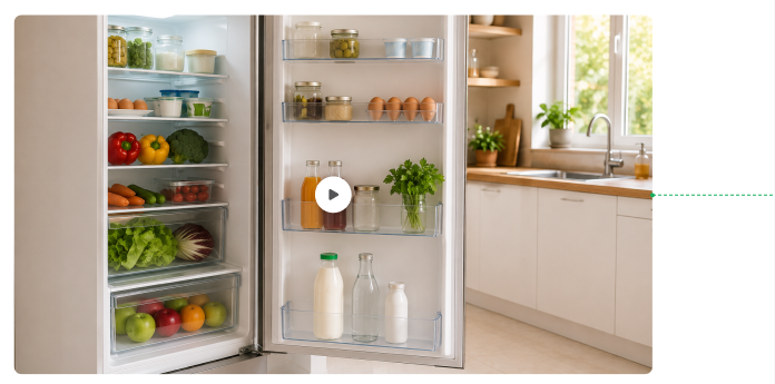
Renders a single image or video across the full width of its container, used as a promotional element on content pages, the homepage, PDPs and PLPs. Assets come from Celum (images) and Ignite (videos) only.
| Field | Field ID | Type | Req. | Loc. | Rules and allowed values | Notes for editors |
|---|---|---|---|---|---|---|
| Market | vileda | JSON object (app) | Yes | No | Set through the Market field app. | Assigns the entry to the market or markets it belongs to. Mandatory on almost every content type – pick the markets in the app interface rather than editing the JSON. |
| Internal Name | internalName | Short text (Symbol) | Yes | No | Free text. | Editorial working title. Not shown on the website; it is the entry title in lists, search and reference pickers. Use a clear, consistent pattern, e.g. “PLP | Mops | Highlight Card”. |
| Media | media | Reference (entry) | Yes | No | Image or Video entries. | The visual. Because it is displayed full width, use a high-resolution asset and set a mobile variant on the Image entry. |
| Anchor | anchor | Short text (Symbol) | No | Yes | Lower-case letters, digits and hyphens only, e.g. how-to-use. | Optional anchor id so this module can be jumped to directly and listed in an anchor navigation. Leave empty when the module is not a jump target. |
| Anchor Label | anchorLabel | Short text (Symbol) | No | Yes | Free text. | The text shown for this anchor in an anchor navigation. Only needed when Anchor is filled. |
| Anchor Icon | anchorIcon | Reference (entry) | No | No | Image entries only. | Optional icon shown next to the anchor label in an anchor navigation. |
Editorial notes
- Links, text and buttons are not supported by this component, even where designs show them.
- Upload one high-quality image to Celum; all required dimensions are derived from it automatically.
19. Steps
Name in Contentful: 🧩 Steps Content type ID: steps Entry title: internalName
Specification:CS-206 (QA Testing on S1)
Design:Steps (Playbook V02)
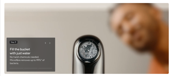
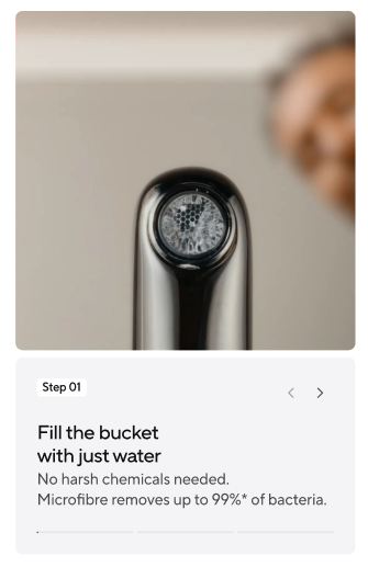
A how-to module that walks visitors through a sequential product usage process, one step at a time, on a full-width image or video with the step card overlaid. Used on product detail pages and content pages where each step can be illustrated with its own clip.
| Field | Field ID | Type | Req. | Loc. | Rules and allowed values | Notes for editors |
|---|---|---|---|---|---|---|
| Market | vileda | JSON object (app) | Yes | No | Set through the Market field app. | Assigns the entry to the market or markets it belongs to. Mandatory on almost every content type – pick the markets in the app interface rather than editing the JSON. |
| Internal Name | internalName | Short text (Symbol) | Yes | No | Free text. | Editorial working title. Not shown on the website; it is the entry title in lists, search and reference pickers. Use a clear, consistent pattern, e.g. “PLP | Mops | Highlight Card”. |
| Steps | steps | List of references (entries) | Yes | No | Step Item entries. Minimum 1, maximum 6. | The steps in order. Keep sequences short – six is the hard limit. |
| Anchor | anchor | Short text (Symbol) | No | Yes | Lower-case letters, digits and hyphens only, e.g. how-to-use. | Optional anchor id so this module can be jumped to directly and listed in an anchor navigation. Leave empty when the module is not a jump target. |
| Anchor Label | anchorLabel | Short text (Symbol) | No | Yes | Free text. | The text shown for this anchor in an anchor navigation. Only needed when Anchor is filled. |
| Anchor Icon | anchorIcon | Reference (entry) | No | No | Image entries only. | Optional icon shown next to the anchor label in an anchor navigation. |
Editorial notes
- Maximum six steps; the progress bar adapts to the number you enter.
- Do not use this module without video content or for non-sequential highlights – use cards instead.
- The step number comes from the position in the list, so reorder rather than renumber.
- Playback, auto-advance and the disabled arrows at the first and last step are handled by the frontend.
20. Step Item
Name in Contentful: 🧩 Step Item Content type ID: stepItem Entry title: internalName
Specification:CS-206 (QA Testing on S1), CS-147 (To Do)
Design:Step Block (Playbook V01)
One step of a Steps sequence: its own media, a title and an optional supporting subtitle. Each step is shown full-bleed with the step card over it on desktop and below the media on mobile.
| Field | Field ID | Type | Req. | Loc. | Rules and allowed values | Notes for editors |
|---|---|---|---|---|---|---|
| Market | vileda | JSON object (app) | Yes | No | Set through the Market field app. | Assigns the entry to the market or markets it belongs to. Mandatory on almost every content type – pick the markets in the app interface rather than editing the JSON. |
| Internal Name | internalName | Short text (Symbol) | Yes | No | Free text. | Editorial working title. Not shown on the website; it is the entry title in lists, search and reference pickers. Use a clear, consistent pattern, e.g. “PLP | Mops | Highlight Card”. |
| Media | media | Reference (entry) | Yes | No | Image or Video entries. | Visual for this step. Short videos work best. |
| Title | title | Short text (Symbol) | Yes | Yes | Free text. | What the user does in this step – start with a verb. |
| Subtitle | subtitle | Short text (Symbol) | No | Yes | Free text. | Optional one-line detail. |
Editorial notes
- Write titles as short, action-led statements of one or two lines at most.
- The subtitle should support the title, not repeat it – one short sentence.
- Use a distinct video per step; avoid reusing the same clip.
- Images are shown for a fixed three seconds; only video length changes the step duration.
21. Link List
Name in Contentful: 🧩 Link List Content type ID: linkList Entry title: internalName
Specification:CS-218 (QA Testing on S1)
Design:Link List (Playbook V02)
Groups several pill-shaped links into one scannable set – quick-access FAQ links on the Help Centre landing page, or a keyword cloud on Rooms content pages. The pills themselves are ordinary Link entries; this component only groups and lays them out.

| Field | Field ID | Type | Req. | Loc. | Rules and allowed values | Notes for editors |
|---|---|---|---|---|---|---|
| Market | vileda | JSON object (app) | Yes | No | Set through the Market field app. | Assigns the entry to the market or markets it belongs to. Mandatory on almost every content type – pick the markets in the app interface rather than editing the JSON. |
| Internal Name | internalName | Short text (Symbol) | Yes | No | Free text. | Editorial working title. Not shown on the website; it is the entry title in lists, search and reference pickers. Use a clear, consistent pattern, e.g. “PLP | Mops | Highlight Card”. |
| Items | items | List of references (entries) | Yes | No | Link entries. Minimum 1. | The pills, in display order. |
| Carousel Rows | carouselRows | Short text (Symbol) | No | No | 1, 2 or 3. | Number of rows the pills are distributed over when they are shown as a carousel. Leave empty to let them simply wrap. |
| Anchor | anchor | Short text (Symbol) | No | Yes | Lower-case letters, digits and hyphens only, e.g. how-to-use. | Optional anchor id so this module can be jumped to directly and listed in an anchor navigation. Leave empty when the module is not a jump target. |
| Anchor Label | anchorLabel | Short text (Symbol) | No | Yes | Free text. | The text shown for this anchor in an anchor navigation. Only needed when Anchor is filled. |
| Anchor Icon | anchorIcon | Reference (entry) | No | No | Image entries only. | Optional icon shown next to the anchor label in an anchor navigation. |
Editorial notes
- Keep labels to roughly three to six words – pills have no fixed width and long labels create uneven rows.
- Avoid duplicate labels or targets within one group; the system does not check for this.
- Keep the group short when all links should be visible without scrolling; a long FAQ-style set can run as a carousel.
- Carousel Rows only has an effect when the pills are shown as a carousel; otherwise they simply wrap.
22. List Block
Name in Contentful: 🧩 List Block Content type ID: listBlock Entry title: internalName
Specification:CS-141 (QA Testing on S1), CS-142 (QA Testing on S1)
Design:List Block (Playbook V02)
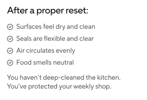
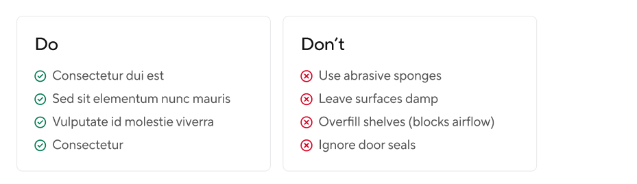
A scannable, non-interactive list of icon-and-label rows for the body of an article or content page. Use it for features, benefits, instructions or results – items that are short, parallel and independent.
| Field | Field ID | Type | Req. | Loc. | Rules and allowed values | Notes for editors |
|---|---|---|---|---|---|---|
| Market | vileda | JSON object (app) | Yes | No | Set through the Market field app. | Assigns the entry to the market or markets it belongs to. Mandatory on almost every content type – pick the markets in the app interface rather than editing the JSON. |
| Internal Name | internalName | Short text (Symbol) | Yes | No | Free text. | Editorial working title. Not shown on the website; it is the entry title in lists, search and reference pickers. Use a clear, consistent pattern, e.g. “PLP | Mops | Highlight Card”. |
| Items | items | List of references (entries) | Yes | No | List Block Item entries. Minimum 1. | The rows, in display order. |
| Anchor | anchor | Short text (Symbol) | No | Yes | Lower-case letters, digits and hyphens only, e.g. how-to-use. | Optional anchor id so this module can be jumped to directly and listed in an anchor navigation. Leave empty when the module is not a jump target. |
| Anchor Label | anchorLabel | Short text (Symbol) | No | Yes | Free text. | The text shown for this anchor in an anchor navigation. Only needed when Anchor is filled. |
| Anchor Icon | anchorIcon | Reference (entry) | No | No | Image entries only. | Optional icon shown next to the anchor label in an anchor navigation. |
Editorial notes
- Use a list only when the items are genuinely parallel; if they read better as a sentence, write prose.
- Items stay in a single column on all screen sizes and carry no links or hover behaviour.
- For a do's and don'ts presentation, build two List Blocks and use the Check and Cross icons.
23. List Block Item
Name in Contentful: 🧩 List Block Item Content type ID: listBlockItem Entry title: label
Specification:CS-141 (QA Testing on S1)
Design:Do's and Don'ts Block (Playbook V02)
One row of a List Block: a leading circle icon plus a short text label. The label also identifies the entry in Contentful, because this type has no internal name.
| Field | Field ID | Type | Req. | Loc. | Rules and allowed values | Notes for editors |
|---|---|---|---|---|---|---|
| Market | vileda | JSON object (app) | Yes | No | Set through the Market field app. | Assigns the entry to the market or markets it belongs to. Mandatory on almost every content type – pick the markets in the app interface rather than editing the JSON. |
| Icon | icon | Short text (Symbol) | Yes | No | Info, Error, Warning, Success, Cross, Check, Close. | Pick the icon by meaning, not by colour: Check/Success for what to do, Cross/Error for what to avoid. |
| Label | label | Short text (Symbol) | Yes | Yes | Free text. | The row text. This is also the entry title in Contentful, so write it so it is recognisable in lists. |
Editorial notes
- Keep labels short and scannable – each row should stand on its own.
24. 2 Column Block
Name in Contentful: 🧩 2 Column Block Content type ID: twoColumnBlock Entry title: internalName
Specification:CS-142 (QA Testing on S1), CS-463 (Done)
A two-column module that places one List Block in each column. Use it when two short lists belong next to each other, for example features on the left and pack contents on the right. Both columns are mandatory, so it is not a way to show a single list.
| Field | Field ID | Type | Req. | Loc. | Rules and allowed values | Notes for editors |
|---|---|---|---|---|---|---|
| Market | vileda | JSON object (app) | Yes | No | Set through the Market field app. | Assigns the entry to the market or markets it belongs to. Mandatory on almost every content type – pick the markets in the app interface rather than editing the JSON. |
| Internal Name | internalName | Short text (Symbol) | Yes | No | Free text. | Editorial working title. Not shown on the website; it is the entry title in lists, search and reference pickers. Use a clear, consistent pattern, e.g. “PLP | Mops | Highlight Card”. |
| Left Column | leftColumn | Reference (entry) | Yes | No | List Block entries only. | The list shown in the left column. Reuse an existing List Block where one fits instead of creating a near-duplicate. |
| Right Column | rightColumn | Reference (entry) | Yes | No | List Block entries only. | The list shown in the right column. Keep both columns roughly the same length so the block looks balanced. |
| Anchor | anchor | Short text (Symbol) | No | Yes | Lower-case letters, digits and hyphens only, e.g. how-to-use. | Optional anchor id so this module can be jumped to directly and listed in an anchor navigation. Leave empty when the module is not a jump target. |
| Anchor Label | anchorLabel | Short text (Symbol) | No | Yes | Free text. | The text shown for this anchor in an anchor navigation. Only needed when Anchor is filled. |
| Anchor Icon | anchorIcon | Reference (entry) | No | No | Image entries only. | Optional icon shown next to the anchor label in an anchor navigation. |
25. Highlight
Name in Contentful: 🧩 Highlight Content type ID: highlight Entry title: internalName
Specification:CS-204 (Dev Testing (D1)), CS-228 (Done); CS-293 (To Do)
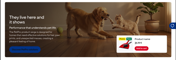
An image-driven module that pairs a visual with a small, freely assembled content slot. Split places the image beside the content, Full uses the whole module width. Added to the component list of a homepage, content page or product detail page.
| Field | Field ID | Type | Req. | Loc. | Rules and allowed values | Notes for editors |
|---|---|---|---|---|---|---|
| Market | vileda | JSON object (app) | Yes | No | Set through the Market field app. | Assigns the entry to the market or markets it belongs to. Mandatory on almost every content type – pick the markets in the app interface rather than editing the JSON. |
| Internal Name | internalName | Short text (Symbol) | Yes | No | Free text. | Editorial working title. Not shown on the website; it is the entry title in lists, search and reference pickers. Use a clear, consistent pattern, e.g. “PLP | Mops | Highlight Card”. |
| Layout | layout | Short text (Symbol) | Yes | No | Split or Full. | Split places the image beside the content, Full uses the whole module width. |
| Background | background | Short text (Symbol) | Yes | No | None, Grey or Image. | Background behind the module. Pick Image only when you also set a Background Image. |
| Background Image | backgroundImage | Reference (entry) | No | No | Image entries only. | The visual of the module. Needed when Background is Image, even though the field is technically optional. |
| Image Side | imageSide | Short text (Symbol) | No | No | Left or Right. | Which side the image sits on. Only relevant for the Split layout. |
| Content Slot | contentSlot | List of references (entries) | Yes | No | Headline, Product Card, Button or Text entries. Minimum 1, maximum 3. | The content shown next to or on top of the image, in display order. One to three entries – typically a Headline plus a Text or Button. |
Editorial notes
- The Content Slot can hold up to three items. A Product Card (maximum one) is always shown on the right; every other item type is always shown on the left.
26. Highlight Block
Name in Contentful: 🧩 Highlight Block Content type ID: highlightBlock Entry title: internalName
Specification:CS-144 (QA Testing on S1), CS-234 (Done), CS-516 (Done)
A single short statement that lifts a concrete fact, figure or takeaway out of running article content. Use it to give one key message its own visual weight between paragraphs.

| Field | Field ID | Type | Req. | Loc. | Rules and allowed values | Notes for editors |
|---|---|---|---|---|---|---|
| Market | vileda | JSON object (app) | Yes | No | Set through the Market field app. | Assigns the entry to the market or markets it belongs to. Mandatory on almost every content type – pick the markets in the app interface rather than editing the JSON. |
| Internal Name | internalName | Short text (Symbol) | Yes | No | Free text. | Editorial working title. Not shown on the website; it is the entry title in lists, search and reference pickers. Use a clear, consistent pattern, e.g. “PLP | Mops | Highlight Card”. |
| Highlight Text | highlightText | Rich text | Yes | Yes | Bold, italic and underline. Links to URLs. No headings, lists or embedded media. | Keep it to one sentence – the format loses its effect as soon as it turns into a paragraph. |
| Anchor | anchor | Short text (Symbol) | No | Yes | Lower-case letters, digits and hyphens only, e.g. how-to-use. | Optional anchor id so this module can be jumped to directly and listed in an anchor navigation. Leave empty when the module is not a jump target. |
| Anchor Label | anchorLabel | Short text (Symbol) | No | Yes | Free text. | The text shown for this anchor in an anchor navigation. Only needed when Anchor is filled. |
| Anchor Icon | anchorIcon | Reference (entry) | No | No | Image entries only. | Optional icon shown next to the anchor label in an anchor navigation. |
27. Quote
Name in Contentful: 🧩 Quote Content type ID: quote Entry title: internalName
Specification:CS-143 (QA Testing on S1), CS-464 (Done)
Highlights a single statement from a Vileda expert or specialist, shown together with the name of the person it is attributed to. Use it in a page component list to lend authority to advice and product content.

| Field | Field ID | Type | Req. | Loc. | Rules and allowed values | Notes for editors |
|---|---|---|---|---|---|---|
| Market | vileda | JSON object (app) | Yes | No | Set through the Market field app. | Assigns the entry to the market or markets it belongs to. Mandatory on almost every content type – pick the markets in the app interface rather than editing the JSON. |
| Internal Name | internalName | Short text (Symbol) | Yes | No | Free text. | Editorial working title. Not shown on the website; it is the entry title in lists, search and reference pickers. Use a clear, consistent pattern, e.g. “PLP | Mops | Highlight Card”. |
| Quote Text | quoteText | Short text (Symbol) | Yes | Yes | Free text. | The statement itself. Keep it to one or two sentences and do not add quotation marks – the design adds them. |
| Author | author | Short text (Symbol) | Yes | Yes | Free text. | Who said it. Name plus role works best, e.g. “Anna Meier, Product Specialist”. |
| Anchor | anchor | Short text (Symbol) | No | Yes | Lower-case letters, digits and hyphens only, e.g. how-to-use. | Optional anchor id so this module can be jumped to directly and listed in an anchor navigation. Leave empty when the module is not a jump target. |
| Anchor Label | anchorLabel | Short text (Symbol) | No | Yes | Free text. | The text shown for this anchor in an anchor navigation. Only needed when Anchor is filled. |
| Anchor Icon | anchorIcon | Reference (entry) | No | No | Image entries only. | Optional icon shown next to the anchor label in an anchor navigation. |
28. Cross-Selling
Name in Contentful: 🧩 Cross-Selling Content type ID: crossSelling Entry title: internalName
Specification:CS-75 (Pre Refined), CS-315 (Ready for Refinement), CS-465 (Done)
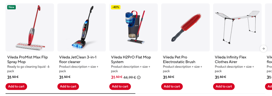
Places a manually configured product recommendation on a page. It names one base product and says whether the recommendation is cross-selling or upselling. Added to the component list of a homepage, content page or product detail page.
| Field | Field ID | Type | Req. | Loc. | Rules and allowed values | Notes for editors |
|---|---|---|---|---|---|---|
| Market | vileda | JSON object (app) | Yes | No | Set through the Market field app. | Assigns the entry to the market or markets it belongs to. Mandatory on almost every content type – pick the markets in the app interface rather than editing the JSON. |
| Internal Name | internalName | Short text (Symbol) | Yes | No | Free text. | Editorial working title. Not shown on the website; it is the entry title in lists, search and reference pickers. Use a clear, consistent pattern, e.g. “PLP | Mops | Highlight Card”. |
| Product | product | Short text (Symbol) | Yes | No | Free text. | The SAP product code of the base product the recommendation is built around. Copy it from SAP, never type it from memory. |
| Relation | relation | Short text (Symbol) | Yes | No | cross-selling, upselling. | Decides which kind of recommendation is shown: complementary products (cross-selling) or higher-value alternatives (upselling). |
29. Social Link
Name in Contentful: 🧩 Social Link Content type ID: socialLink Entry title: internalName
Specification:CS-125 (QA Testing on S1)
One social media channel in the footer. You choose the channel and supply the URL; the icon is derived automatically from the channel.
Editorial notes